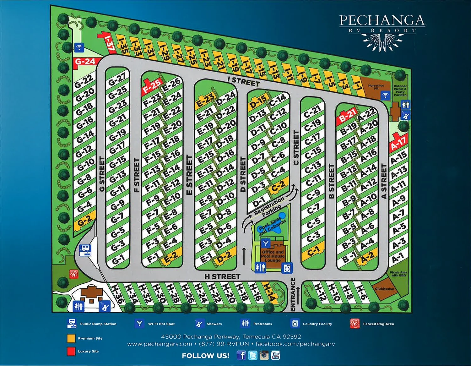
Pechanga RV Resort Map
Case Study: Turning a Complex Property into a Clear, Usable Map
The Pechanga RV Resort Visitor Map was updated to reflect the expansion of the RV Park at Pechanga Resort Casino. The redesigned map was created to enhance the guest experience by making the property easier to navigate while presenting the resort in a clean, professional, and welcoming way. The previous version needed to evolve into a more modern, user-friendly piece that could serve both practical and promotional purposes. The final design became an important resource for helping visitors quickly understand the layout of the resort while reinforcing the premium brand image of Pechanga Development Corporation and Pechanga RV Resort.
-
This project required building the map from scratch with limited guidance and an evolving architectural layout. Key information—such as parking space locations, amenities, and entry/exit routes—had to be communicated clearly within a confined 8.5" x 11" format. Additional challenges included keeping the design consistent with the previous color scheme, selecting appropriate visual elements, and creating a layout that remained usable even as the property continued to change.
-
The design focused on simplifying the layout through clear structure and visual hierarchy. Color was used to separate sections of the map, allowing users to quickly identify different areas of the park. Roads, parking spaces, and amenities were prioritized to guide navigation, while a legend was included to clarify icons and improve usability. Reference examples from other RV maps helped inform the overall organization and clarity of the design.
-
The final map provided a more streamlined and visually consistent layout that improved readability and navigation. Key features such as clearly defined parking areas, labeled amenities, and a more intuitive flow made it easier for users to find their location and move through the park. The addition of a space to identify assigned parking added practical value that was not present in the previous version.
-
The completed map was implemented as a printed on-site tool and distributed digitally through RV-related platforms. It improved clarity for users and provided a more professional presentation of the property. The design was accepted with minimal revisions and has continued to influence updated versions, with many of its core elements still in use today.
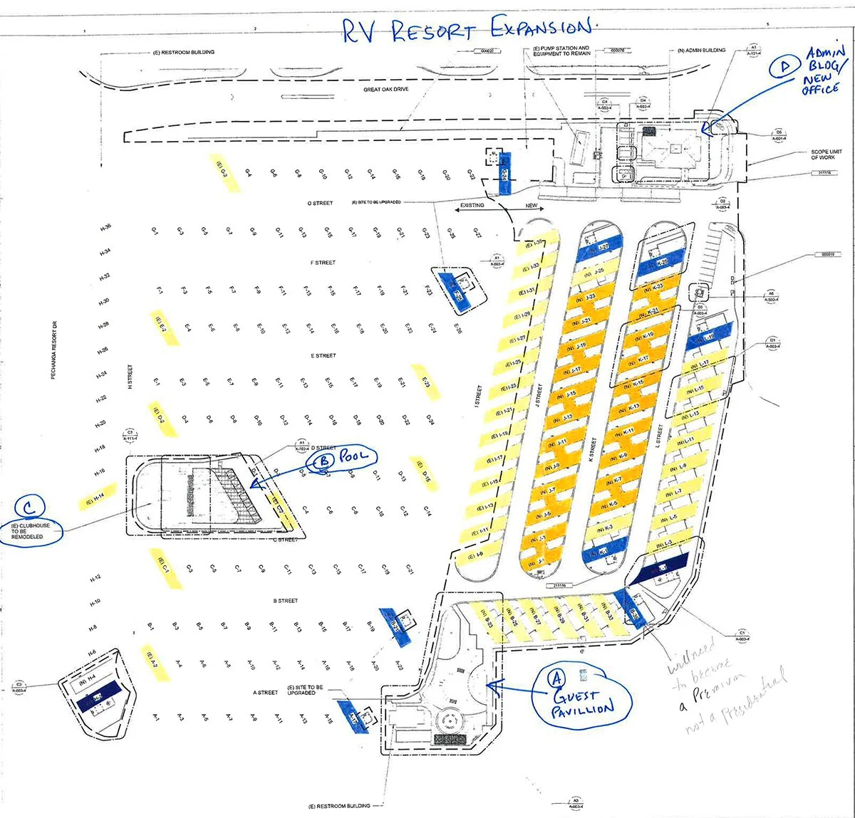
Architect map used as reference
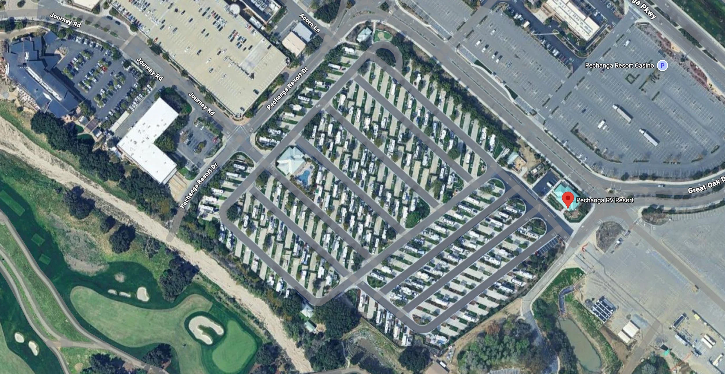
Overhead satellite image used as reference
Original map provided for reference
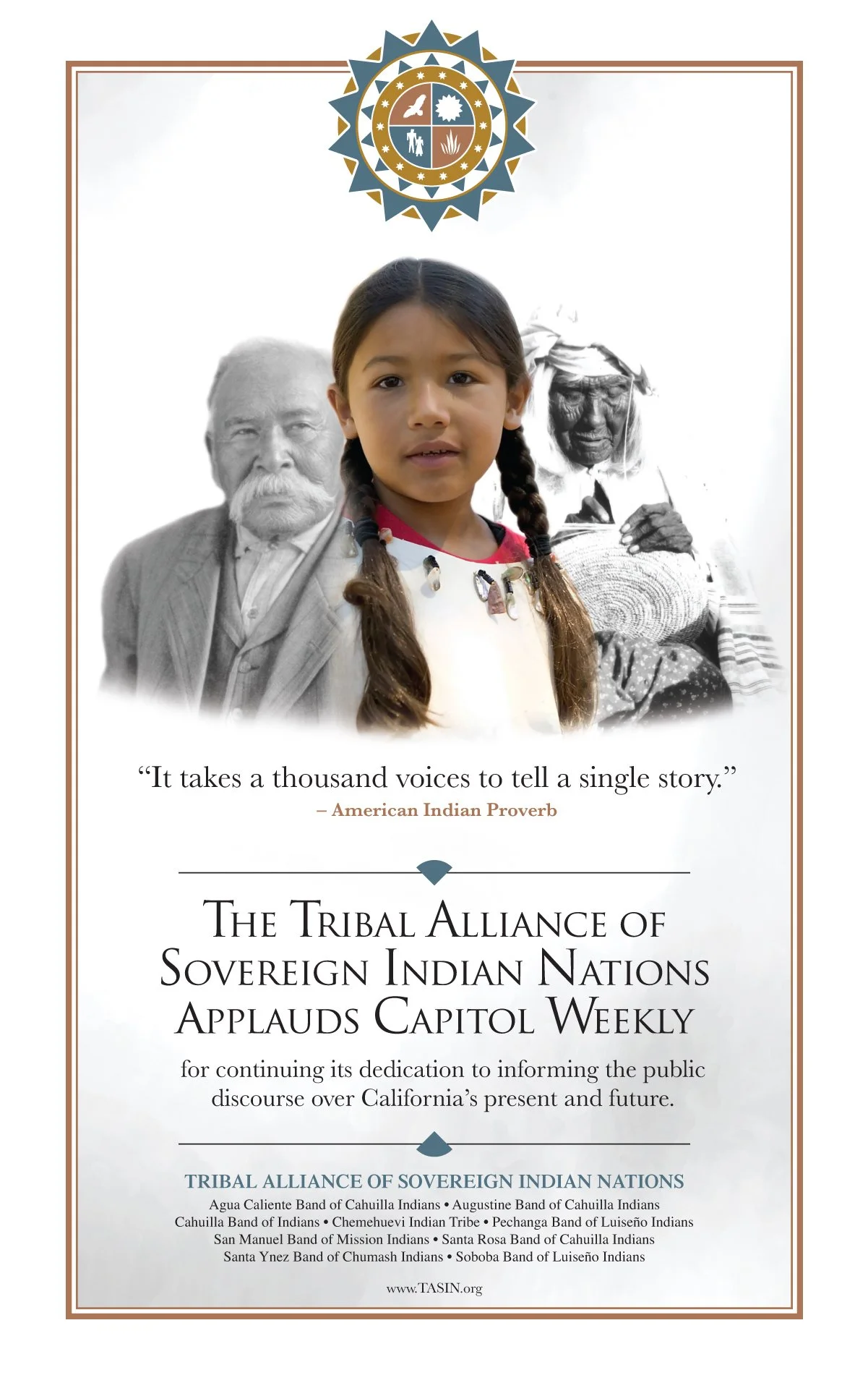
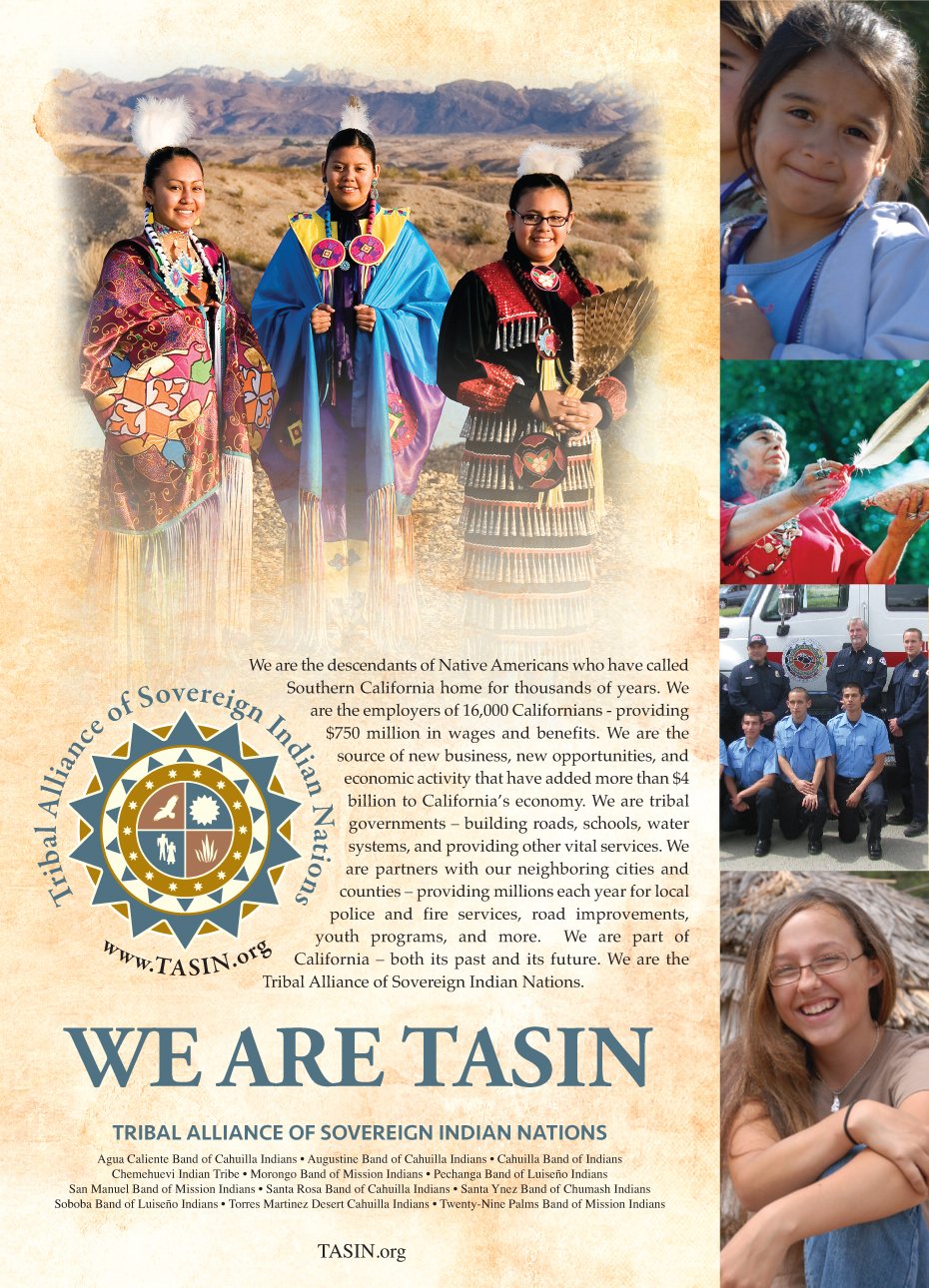
Design Solutions for Tribal Communities
While working with the Pechanga Band of Indians, the Tribal Alliance of Sovereign Indian Nations, and affiliated organizations, I developed communication materials designed to inform communities, promote events, and support outreach initiatives. I also created visually consistent marketing pieces that strengthened public awareness, engagement, and organizational branding. Projects included brochures, newsletters, banners, event materials, trade show displays, vehicle graphics, advertisements, and digital promotions tailored to a wide range of audiences. Each piece was designed to communicate clearly, maintain brand consistency, and support the goals of the organization through professional and effective visual design.
-
Projects often required deliverables under tight deadlines while maintaining a consistent visual identity for each of the different organizations across print and promotional formats.
-
I created cohesive designs that could scale across flyers, brochures, banners, ads, and newsletters while keeping messaging clear and visually engaging.
-
Created a wide range of marketing materials including banners, brochures, flyers, print advertisements, newsletters, and event materials.
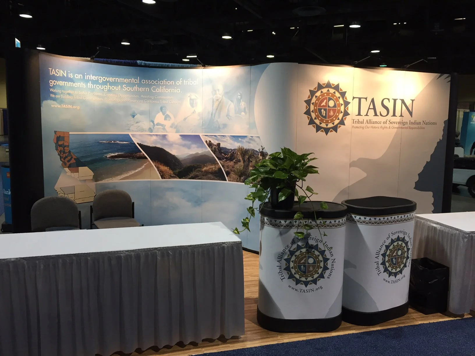
TASIN Trade Show Exhibit
Case Study: Creating a Clear and Recognizable Presence in a Crowded Environment
The TASIN Trade Show Exhibit was designed to increase public awareness of the Tribal Alliance of Sovereign Indian Nations by presenting a strong, professional presence at conference events. The booth served as an informational platform to communicate tribal history, government efforts, and the collective identity of member tribes. The goal was to create a visually clear and recognizable exhibit that could attract attention and support meaningful engagement in a busy trade show setting.
-
Trade show environments are visually crowded, requiring designs to stand out quickly and communicate effectively at a distance. The primary constraint was the physical size of the booth and how the graphics would be divided across multiple panels. The design needed to be highly visible, easy to read from afar, and still communicate key information without overwhelming the viewer.
-
The booth was approached similarly to a logo design problem—focusing on simplicity, clarity, and immediate recognition. The layout was built around a strong focal point using the TASIN eagle, enlarged to create a dominant visual element visible from a distance. Supporting imagery was added to represent the diverse geographic regions of California—coastal, desert, and mountain landscapes—helping reinforce the identity and reach of the member tribes.
-
The final design featured a large-scale eagle graphic positioned against a clean background to anchor the booth visually. Supporting images and messaging were arranged to guide the viewer’s eye naturally across the space. A consistent color palette, based on TASIN branding and sky tones, helped unify the design. Additional elements, including panel graphics and printed counter displays, complemented the main structure and extended the visual system across the full exhibit.
-
The exhibit was produced as a multi-panel display, requiring the artwork to be carefully divided and prepared for large-format printing. Files were scaled and adjusted based on printer specifications to ensure clarity and quality at full size. The final layout was optimized for visibility by testing readability at reduced zoom levels, simulating long-distance viewing conditions.
-
The completed exhibit created a strong visual presence at trade show events, helping TASIN stand out in crowded environments. The design was reused across multiple events and contributed to increased visibility and awareness of the organization. By combining clear branding with purposeful imagery, the booth provided an effective platform for outreach and communication.
Media, Event & Promotional Design
Logo Design • Event Identity • Promotional Campaigns
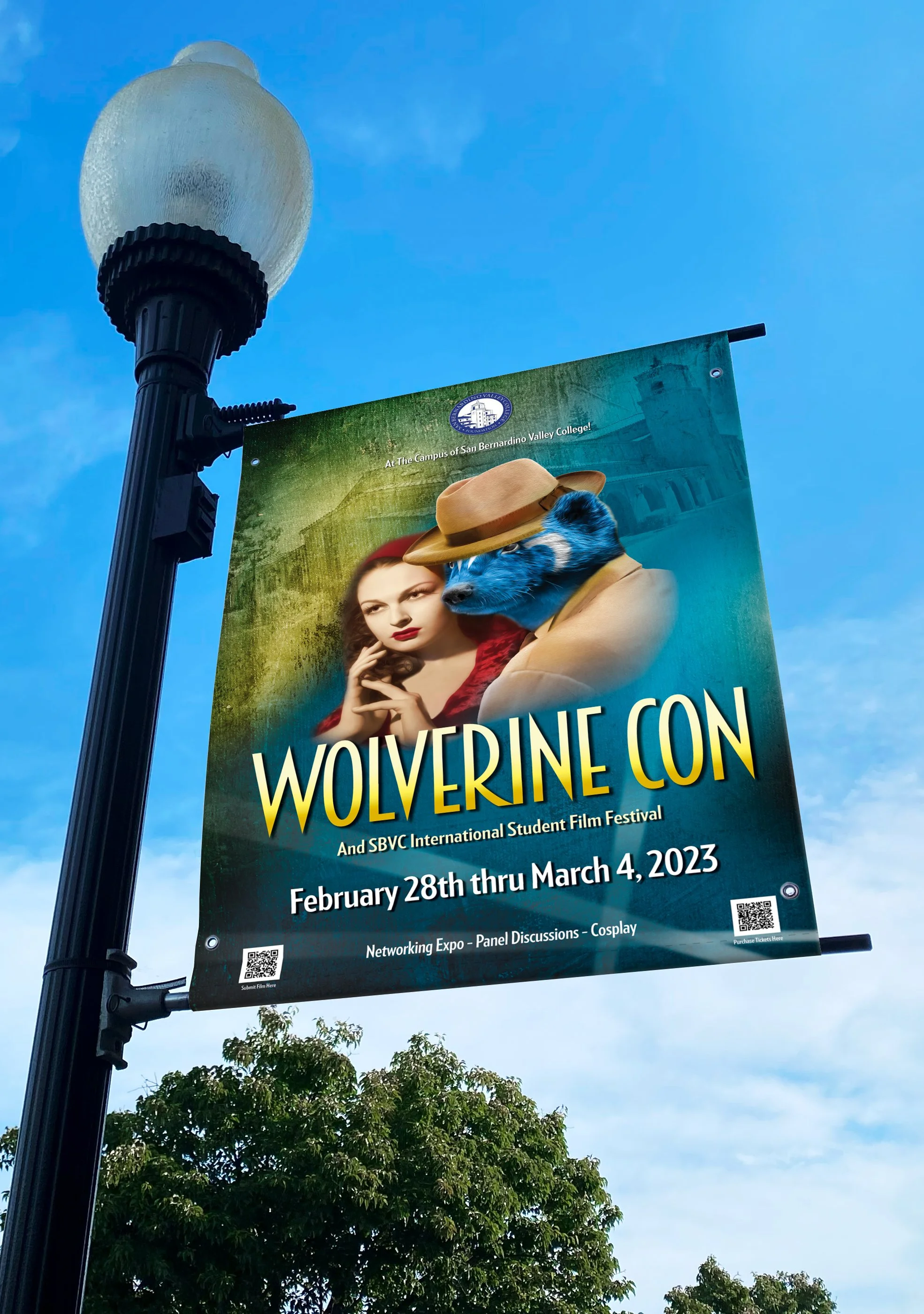
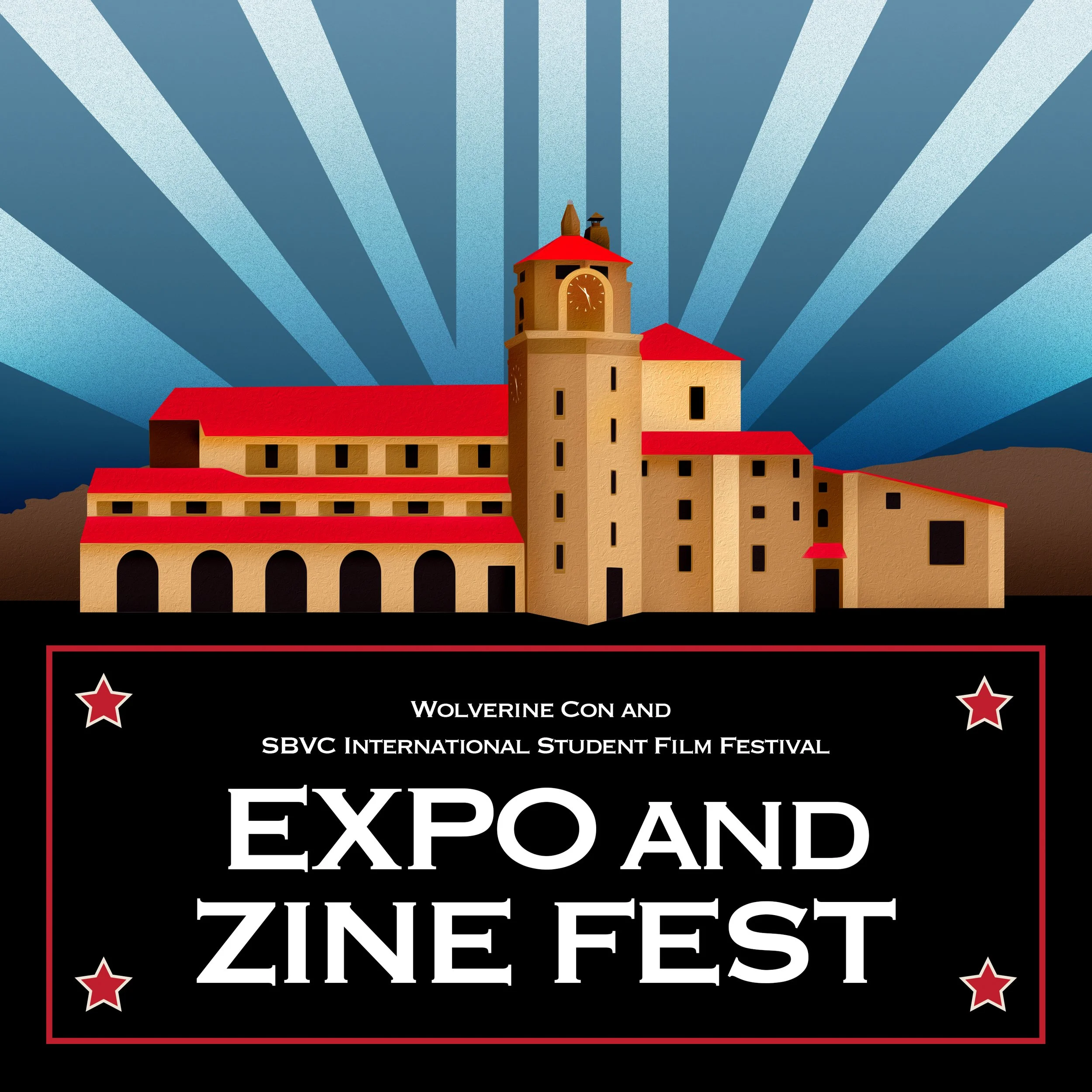
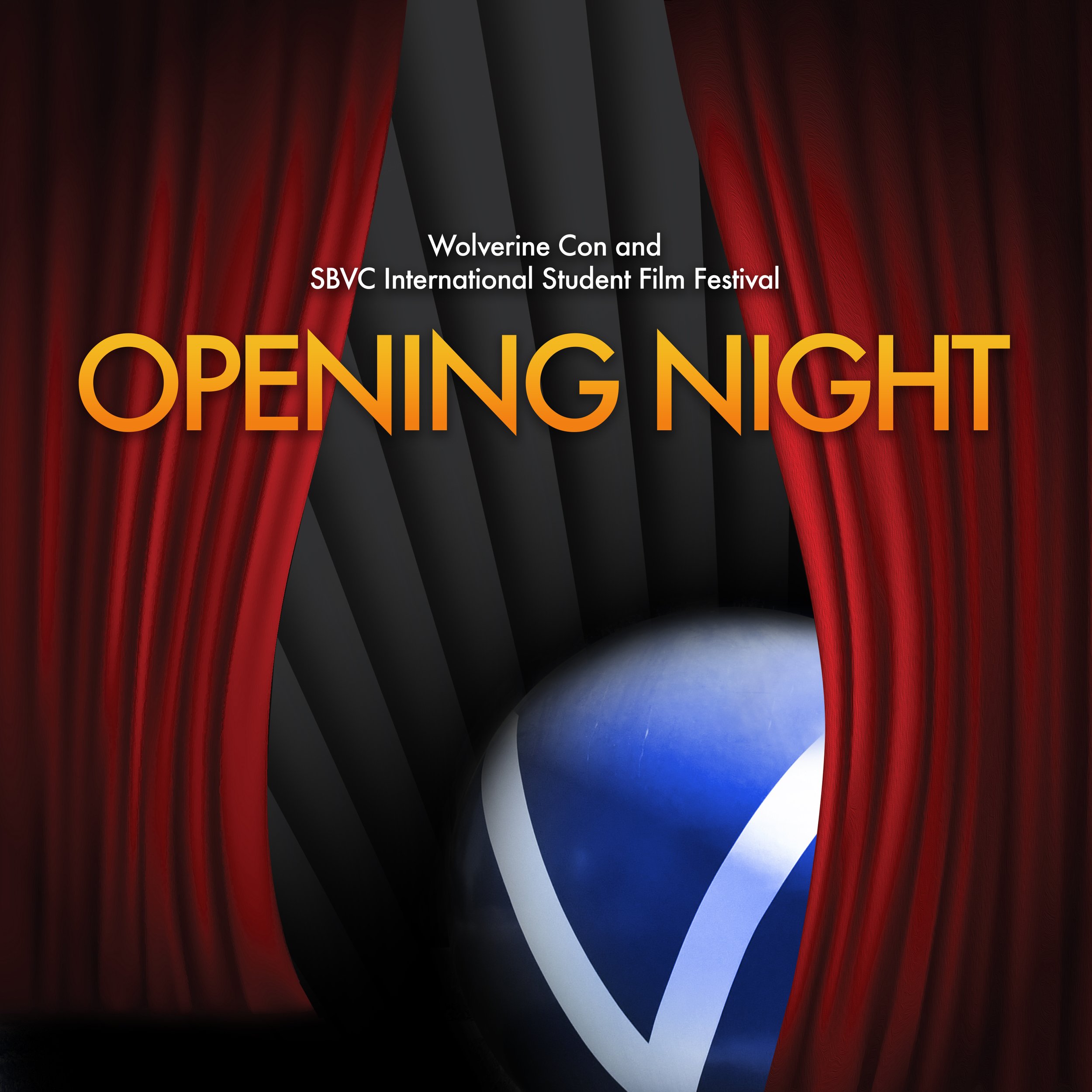
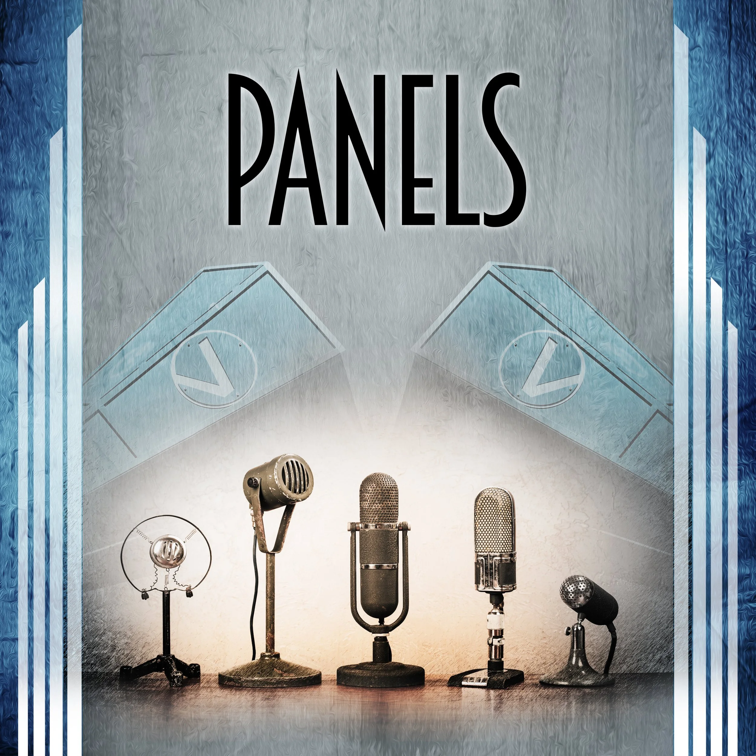
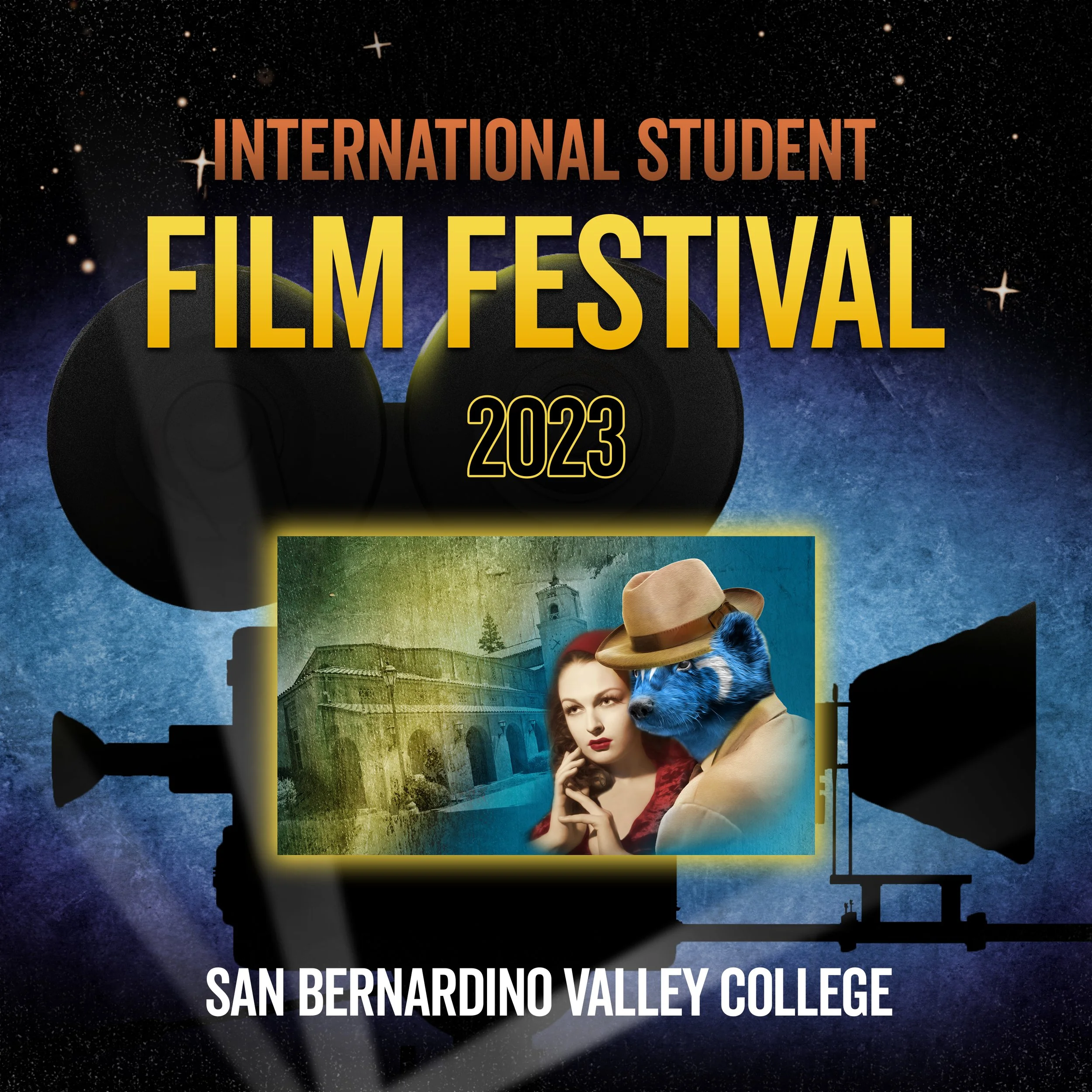
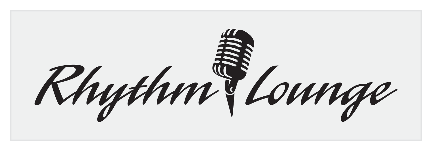
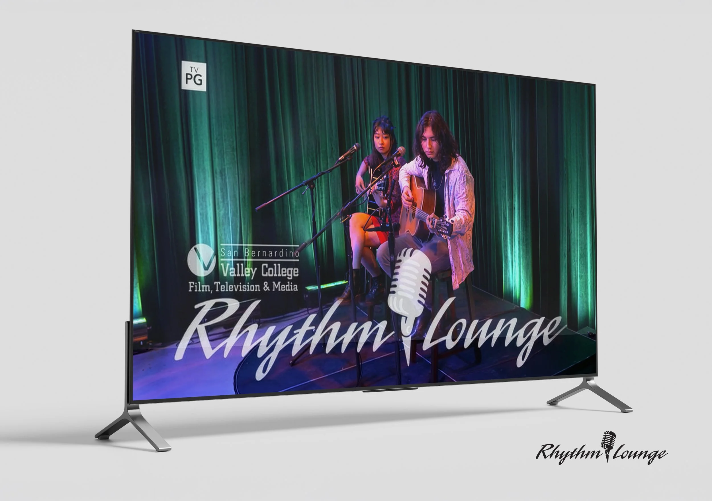
Developed visual identities and logo designs for student-driven entertainment and media initiatives at San Bernardino Valley College, including the Wolverine Con International Student Film Festival and the Rhythm Lounge television music series produced in partnership with KVCR.
The logos and supporting branding systems were created to establish energetic, modern visual identities for film festivals, live music programming, broadcast media, and community-focused events. Design applications included promotional graphics, digital marketing materials, event signage, television graphics, and social media assets developed to support public engagement and brand recognition across multiple platforms.
Deliverables:
Logo Design • Event Branding • Promotional Graphics • Digital Marketing Assets • Television Graphics • Social Media Design • Event Signage
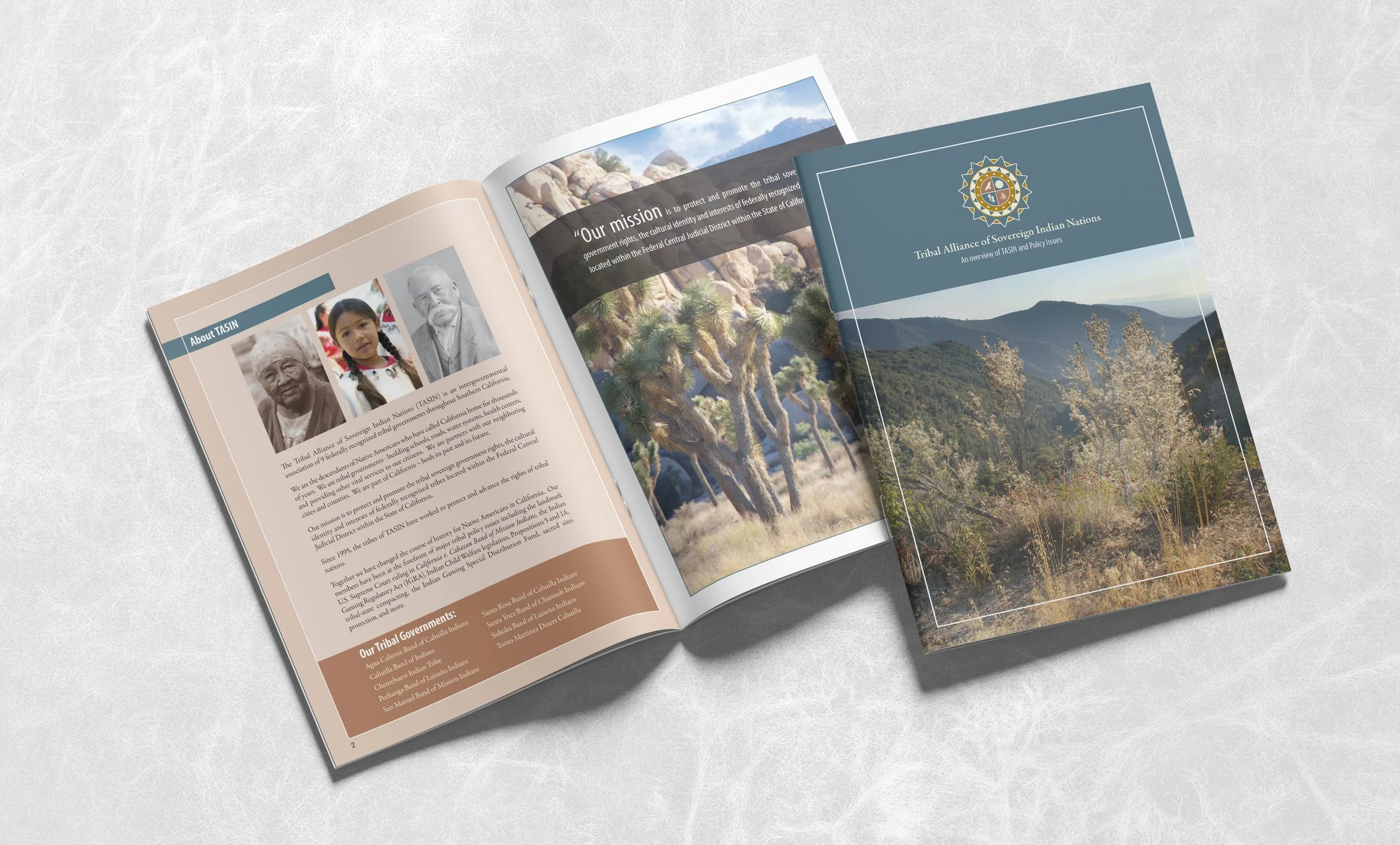
TASIN Organizational Brochure Design
The TASIN brochure was developed to communicate the mission, history, policy priorities, and community impact of the Tribal Alliance of Sovereign Indian Nations in a clear and professional format. Through thoughtful layout, consistent branding, and imagery, the final piece helped present complex topics in a way that was informative, approachable, and visually compelling.
The finished brochure served as a valuable outreach tool that strengthened organizational credibility, increased public understanding, and supported TASIN’s ongoing connection with communities throughout California.
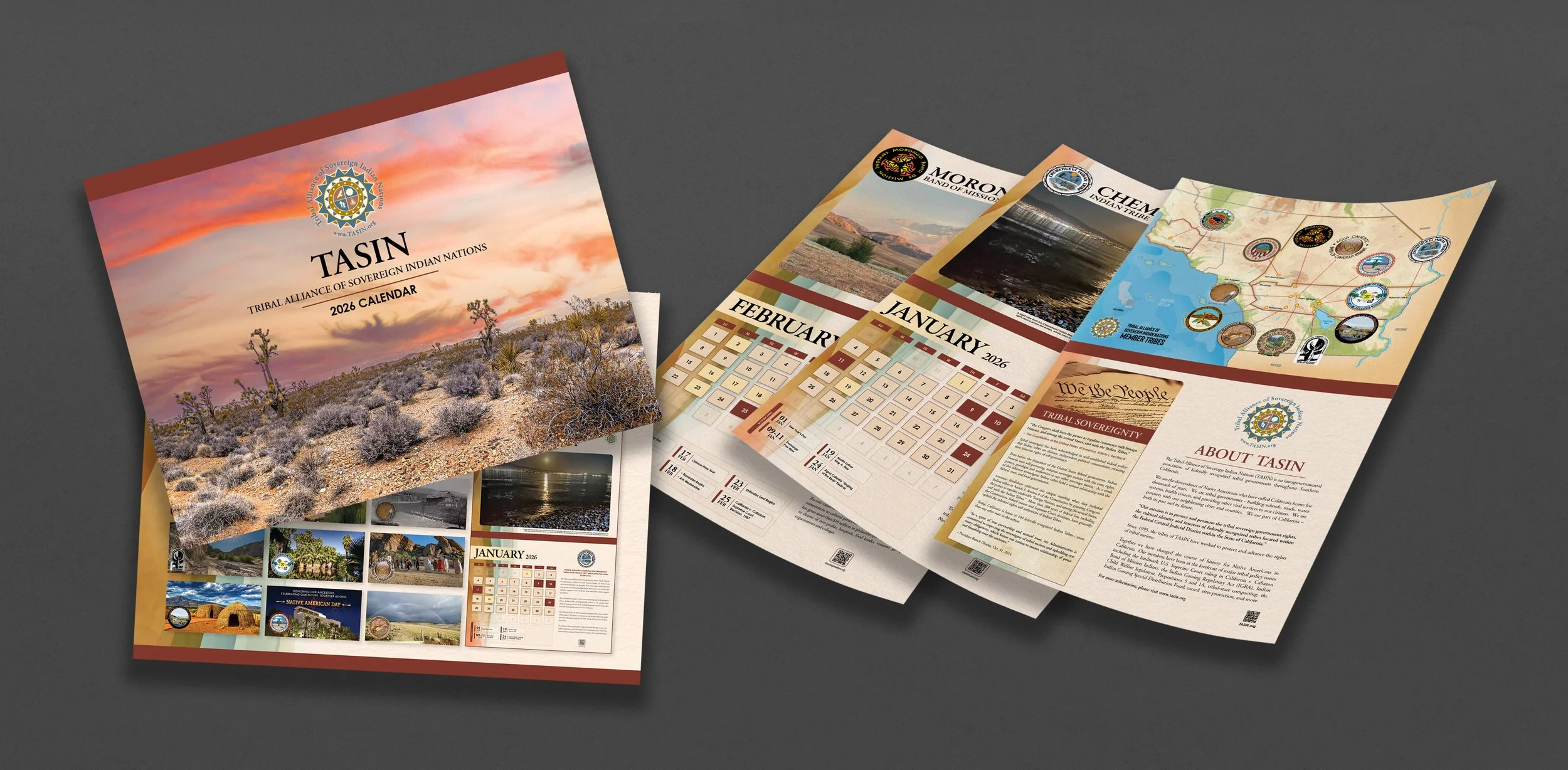
TASIN 2026 Calendar
The TASIN 2026 Calendar was designed as an educational outreach piece that highlights the history, culture, and presence of tribal nations throughout Southern California. Distributed to local, state, and federal employees, as well as local schools, it helped promote awareness and understanding through a clear and professional format.
This project is important because it combines editorial layout, branding, typography, and multi-page design into one cohesive publication. It demonstrates the ability to create polished visual communication that is both informative and meaningful.
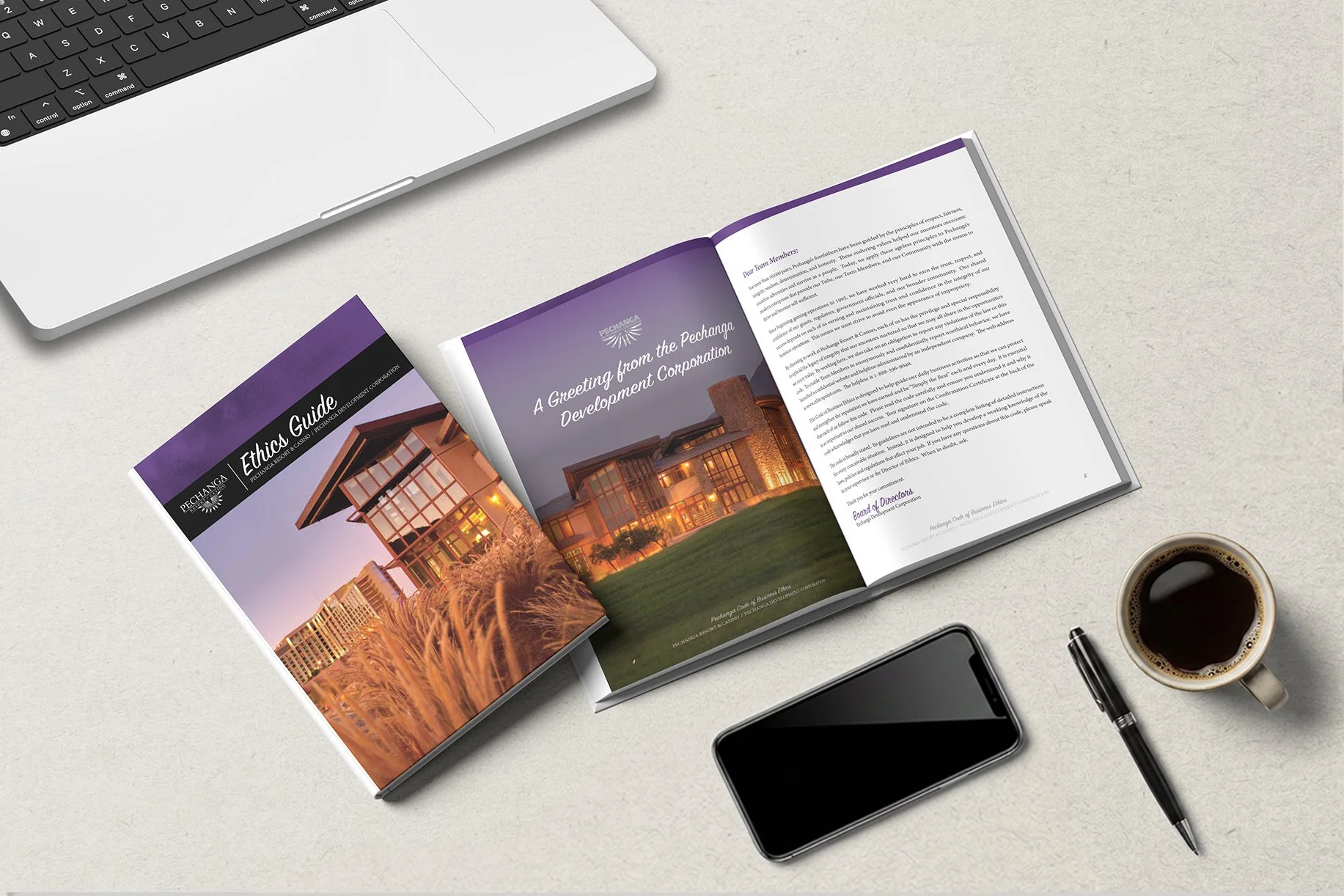
Pechanga Ethics Guide
The Ethics Guide was designed as an easy-to-follow resource that explains the standards and expectations of the Pechanga Resort and Casino. Using a simple layout, readable typography, and clear organization, the guide turned detailed information into a polished and user-friendly publication. The final piece helped create consistency, awareness, and better communication throughout the organization.
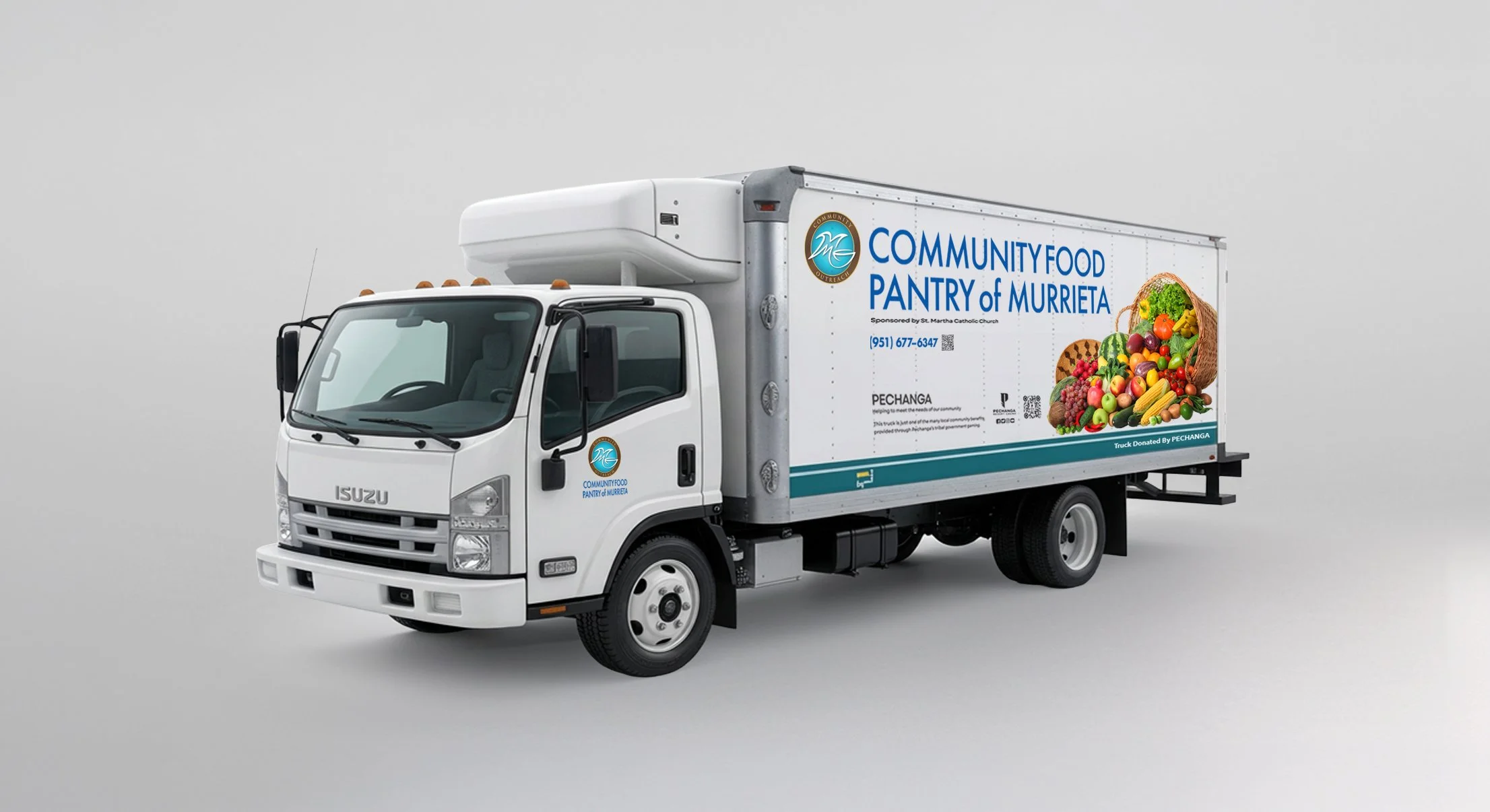
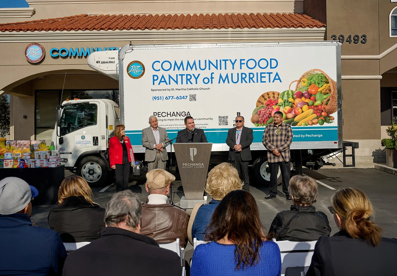
Pechanga Community Donation Truck Graphics
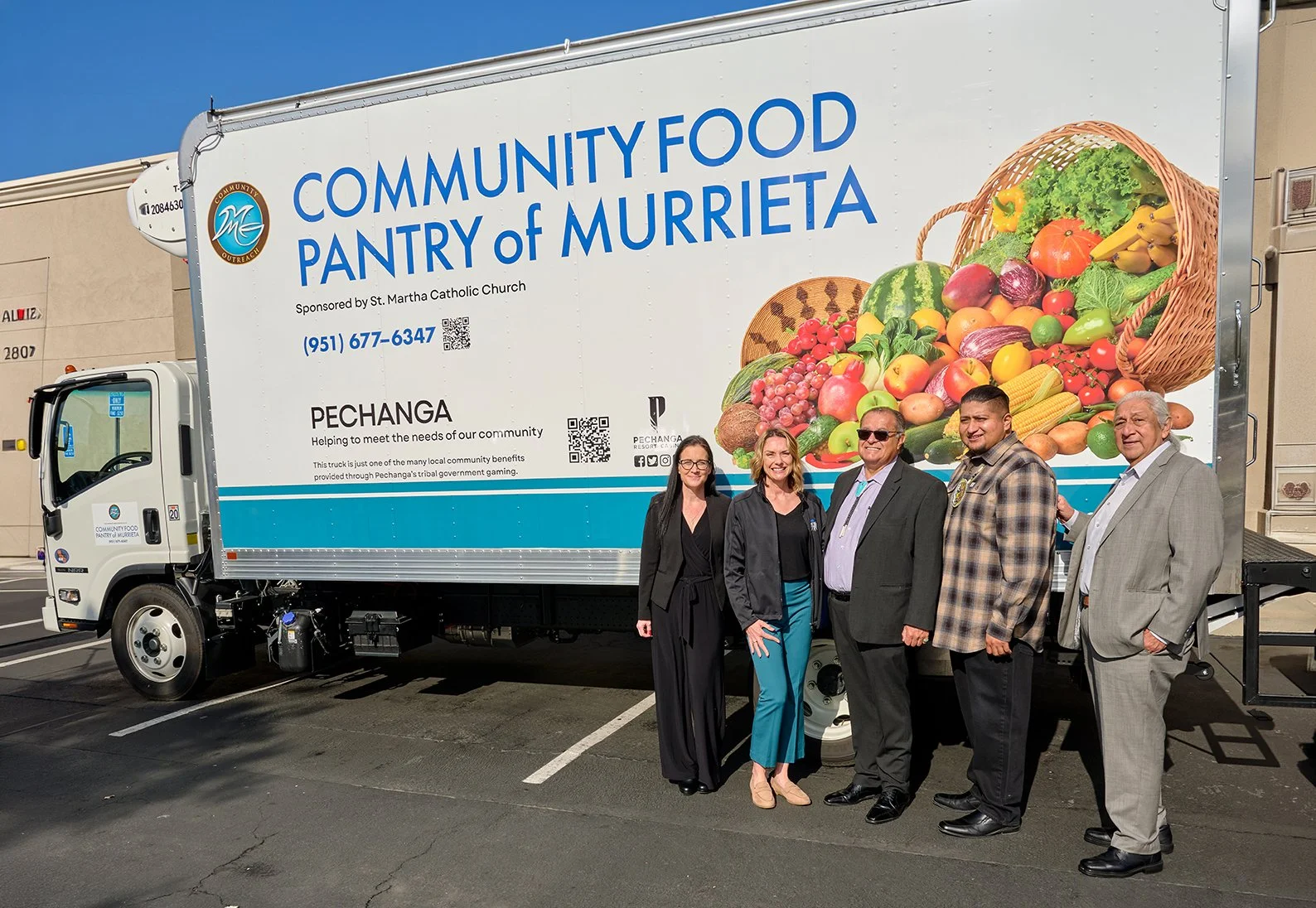
The Pechanga Band of Indians Community Donation Truck Graphics project was created to refresh a vehicle donated to support local community charities while maintaining a visual style similar to its previous design. The updated graphics focused on preserving brand recognition, improving overall appearance, and presenting a clean, professional look that reflected Pechanga’s continued commitment to giving back. By modifying the existing design while keeping familiar elements, the finished truck served as a recognizable and meaningful symbol of community support wherever it traveled.
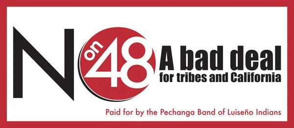
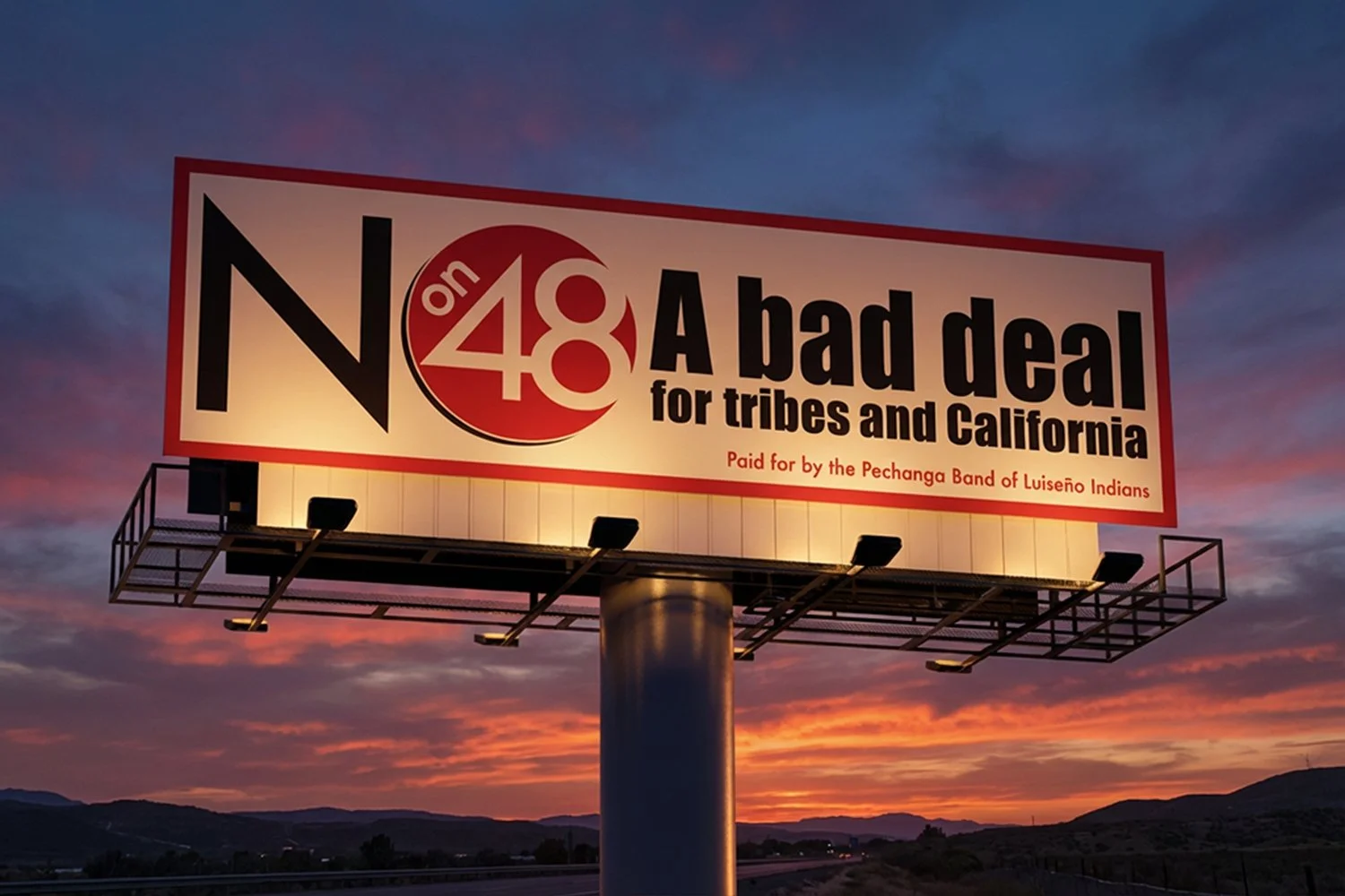
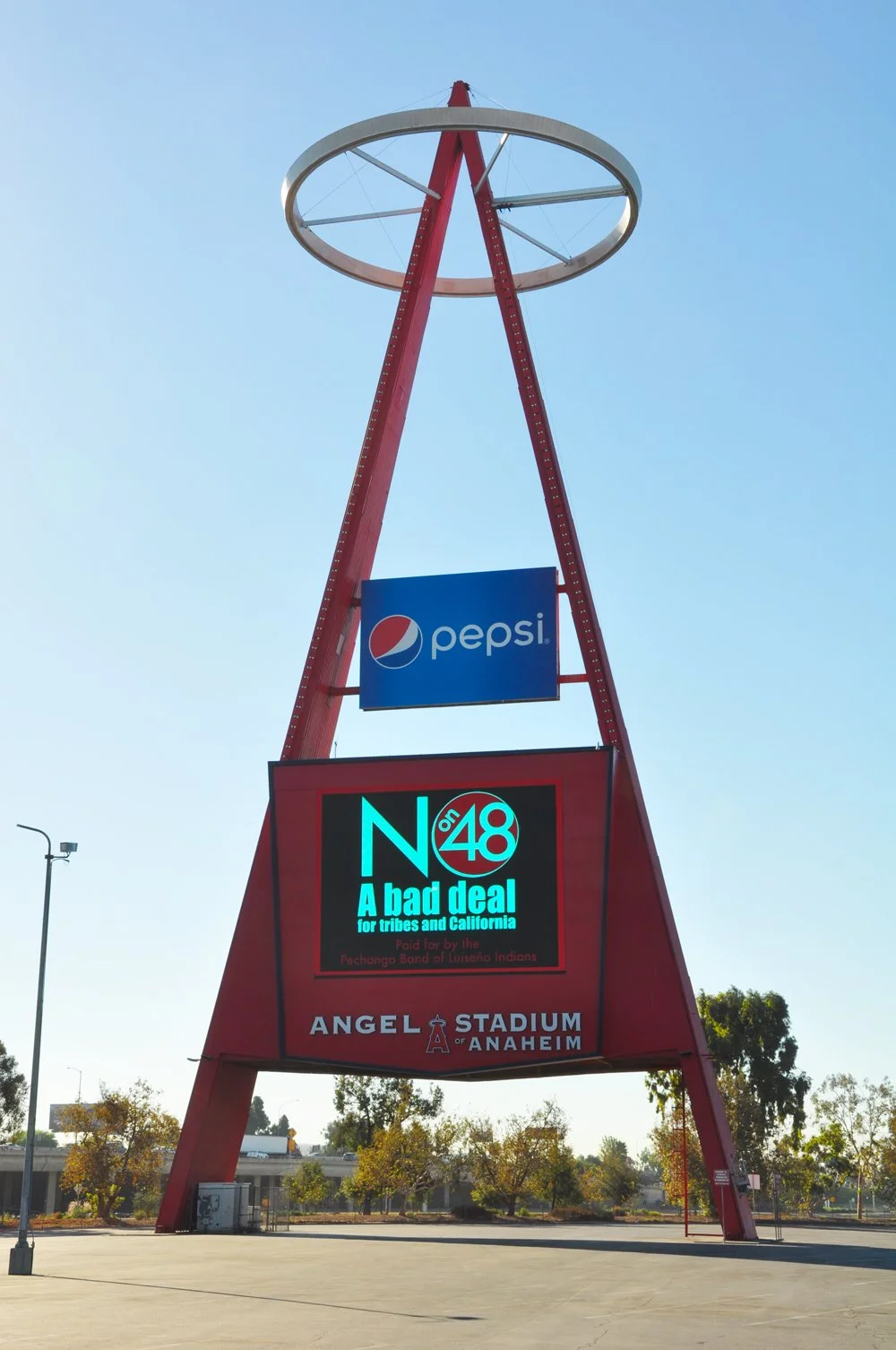
The No on 48 campaign in California was developed to educate voters about Proposition 48 and communicate reasons for opposing the measure. The campaign relied on strategic design, print materials, and community outreach to present complex information in a clear and engaging way. Through bold visuals, concise messaging, and targeted communication, the campaign connected with voters across the state during a major election cycle. I contributed to the development of campaign materials that supported voter awareness efforts and helped drive a successful statewide result, with 60.96% voting No.
No on 48 Billboard Campaign
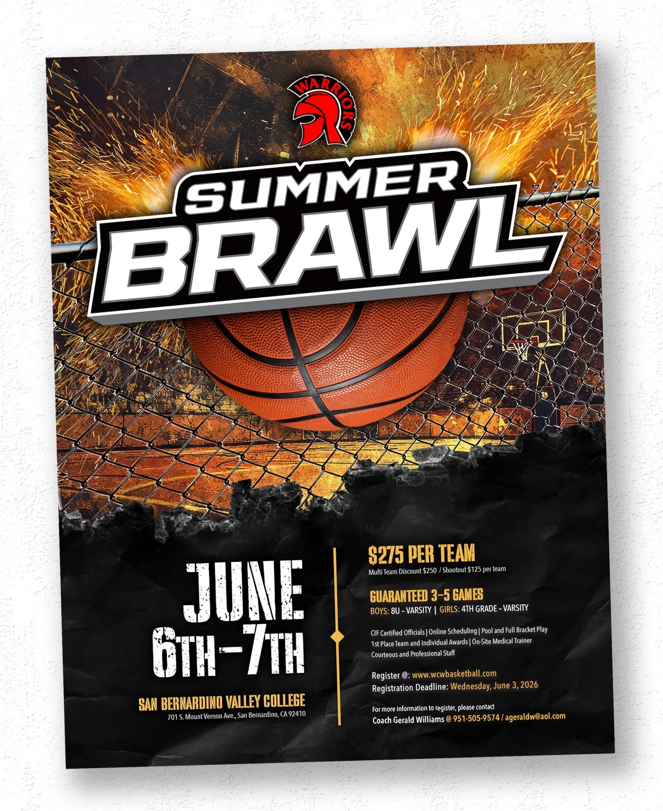
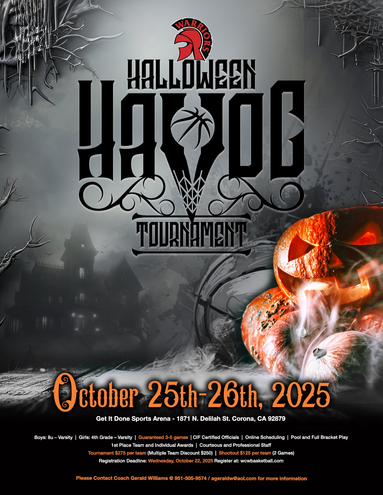
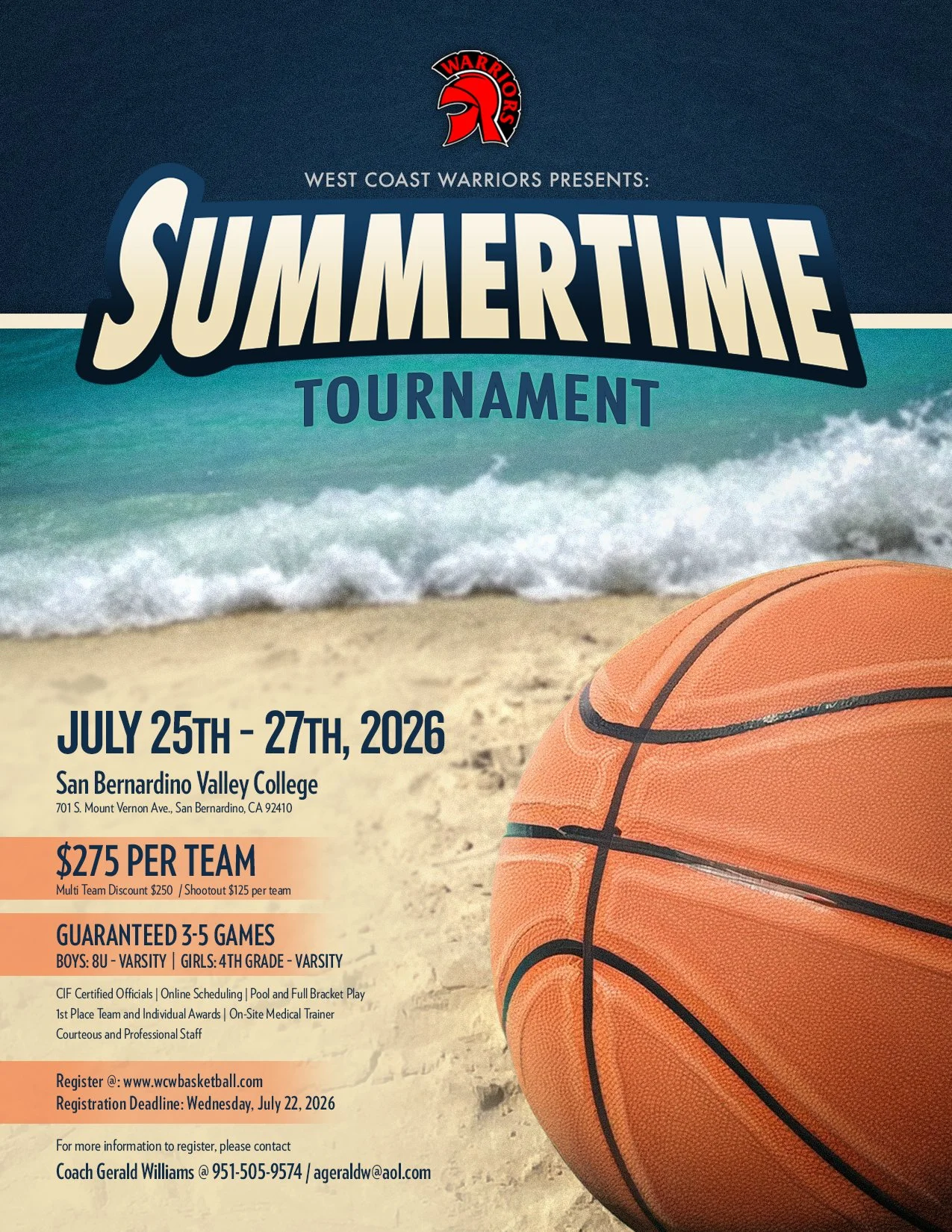
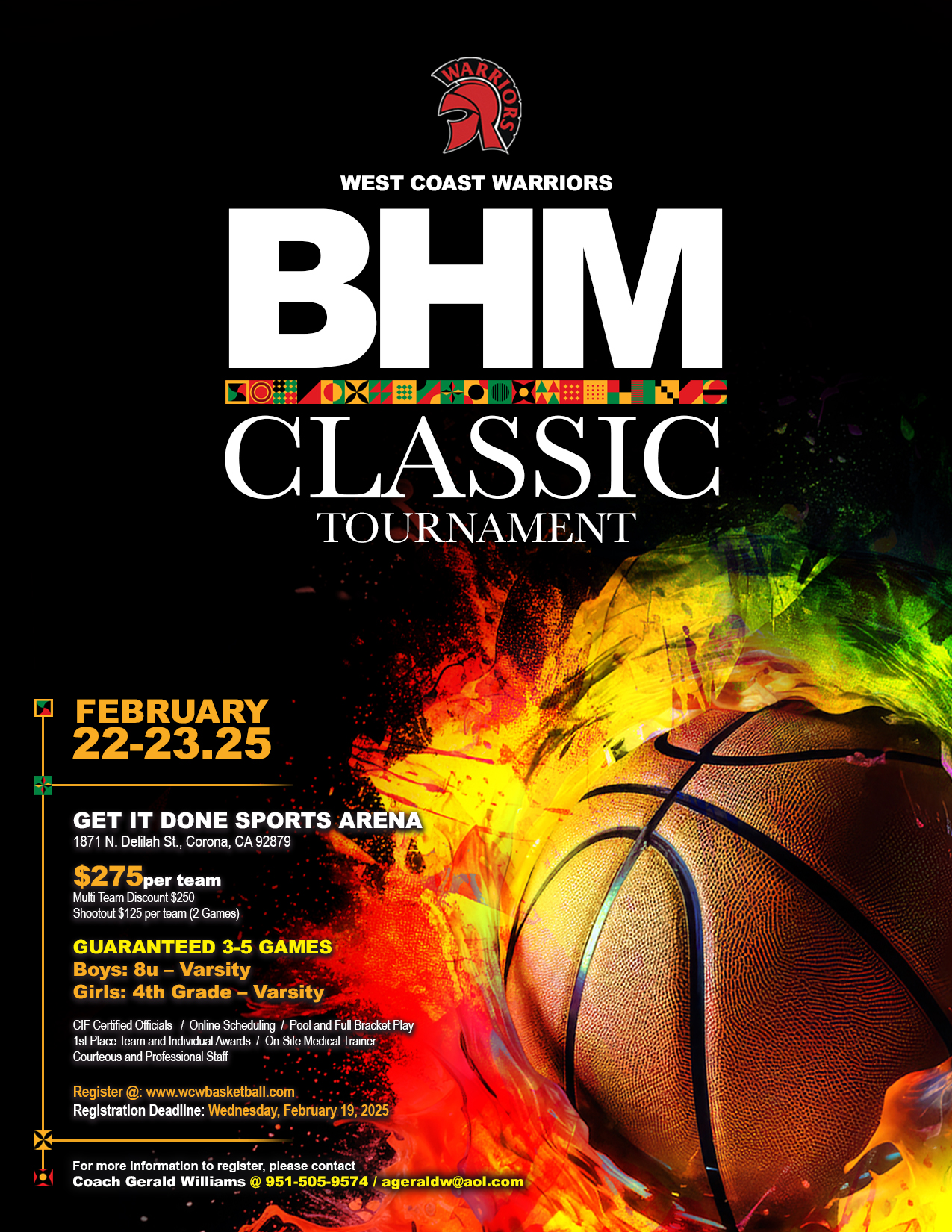
West Coast Warriors Tournament Branding Campaign
The West Coast Warriors Promotion Campaign was developed to support youth travel basketball tournaments held throughout the year at various locations. The goal was to create a series of promotional materials that would increase event visibility, strengthen brand recognition, and drive participation. The primary audience included coaches, teams, and organizations searching for competitive tournaments, making it essential to communicate key information quickly while maintaining a strong and recognizable visual identity.
Case Study: Building a Consistent Tournament Branding System
-
Youth sports promotions compete for attention in a crowded and fast-moving environment. Each tournament needed to stand out while clearly communicating essential details such as date, location, and registration information. The campaign also required producing a high volume of materials on tight timelines, with no provided imagery, while maintaining a consistent level of quality across all events.
-
The campaign was built around a flexible but consistent visual system. Each event was designed with a unique theme based on the tournament name and time of year, helping create variety and excitement while keeping the overall brand recognizable. The West Coast Warriors logo remained a constant anchor across all materials, supported by high-energy imagery and bold compositions. Information hierarchy was structured to prioritize event title, date, and location, ensuring clarity at a glance.
-
A series of themed promotional graphics were created across flyers, digital formats, and apparel. Designs were developed with adaptability in mind—often starting with apparel concepts and extending into flyer designs to maintain consistency across platforms. Seasonal themes, dynamic typography, and basketball-focused imagery helped create a sense of energy and competition, while consistent branding reinforced recognition across multiple events.
-
Over the course of a calendar year, the campaign included approximately 18 flyers and 9 apparel designs, with new concepts developed regularly and updated seasonally. Each piece was created from scratch or adapted to fit new tournament themes, ensuring that the campaign remained fresh while maintaining a cohesive visual direction. Advance planning with the client allowed for more efficient production and consistent delivery.
-
The campaign brought a higher level of professionalism and consistency to the organization’s promotional efforts. Over time, it contributed to increased visibility, growing audience engagement, and a steady rise in interest and participation. The designs were reused across multiple seasons and helped establish a recognizable and credible brand presence for West Coast Warriors within the youth basketball community.